Over the past 20 years, Pantone has influenced multiple industries on a global scale in terms of product development and purchasing decisions. Each January, the brand announces the color of the year and defines the trend in fashion, furniture, design, packaging, and countless other fields.
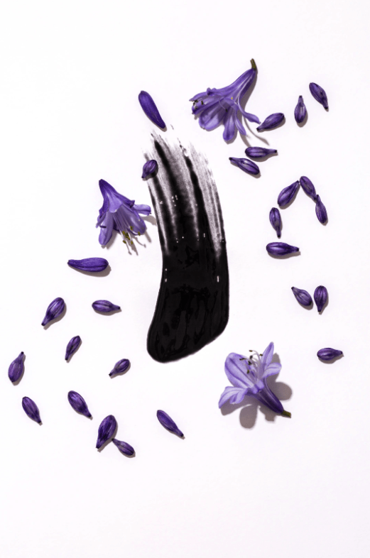
This time, Very Peri is the Pantone Color of the Year for 2022. A color “whose courageous presence encourages personal inventiveness and creativity,” according to the famous Color Institute.
As we move into a world of unprecedented change, the selection of PANTONE 17-3938 Very Peri brings a novel perspective and vision of the trusted and beloved blue color family, encompassing the qualities of the blues, yet at the same time with its violet red undertone, PANTONE 17-3938 Very Peri displays a spritely, joyous attitude and dynamic presence that encourages courageous creativity and imaginative expressions.
Leatrice Eiseman, Executive Director of Pantone Color Institute


But how is the decision made?
The Pantone Color Institute is composed of a group of experts that specialize in researching and understanding which color will be defining the upcoming year. To reach a decision they might look at the entertainment industry, films in production, art collections, up-and-coming artists, new design trends, socio-economic conditions, and the tech world.
Anything from materials, textures, and sounds can influence the final choice.
Why is Very Peri the color for 2022?
According to Laurie Pressman, Vice President of the Pantone Color Institute, “the Pantone Color of the Year reflects what is taking place in our global culture, expressing what people are looking for that color can hope to answer.”
Keeping in mind the transformative times we are living in, Very Peri represents the global spirit of the transition we are going through. From intense isolation to opening doors to dynamic virtual worlds, society is setting the way to merging physical and digital lives and altering standards.
In this scope, PANTONE 17-3938 Very Peri combines the trusted vision of the blue color family with the dynamic and joyous approach of red and violet undertones.

Where can we expect to see Very Peri?
In 2022, you can expect to see PANTONE 17-3938 Very Peri mentioned in global color trends, new products, visual brand identities, and more.
To highlight the color chosen, Pantone usually establishes collaborations with other brands as well. Taking 2021 as an example, where the Colors of the Year were Ultimate Gray and Illuminating Yellow, Pantone has partnered with the Russian casual ready-to-wear label Monochrome to design a limited-edition collection.

Are you looking to adopt the Pantone Color of the Year in your upcoming campaigns? Find samples of Cherrydeck members below, who can represent the 2022’s trends in your visual content:
To discover more Cherrydeck members, click here. To get inspired for your upcoming campaigns, have a look at the Brand Content section on our blog.


2 replies on “Pantone Color of the Year 2022 — Get to Know Very Peri”