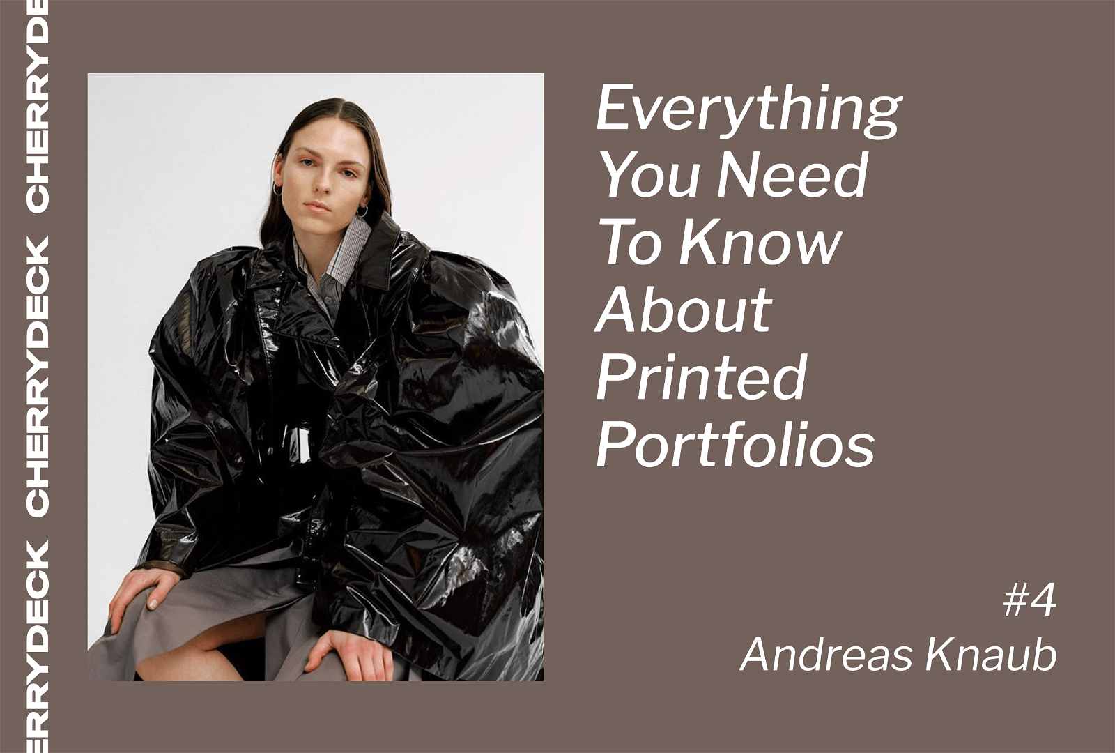
More than a refreshing way of showcasing your work, a paper portfolio is useful when it comes to gaining new insights about your photography and can be a complete discovery experience. Today, Andreas Knaub tells us how to create a great paper portfolio and boost the creative potential.
In this series “How to Create a Great Paper Portfolio” we ask photographers about their view on printed photography portfolios and share tips and insights about how to produce a high-quality book.
After Nick, Inge and Ben, now is the Berlin-based photographer Andreas Knaub, who shares his valuable insights on the topic.
Think about it as if it was a presentation. Good presentations — where someone speaks on his own, should not be longer than 20 minutes. From 20 minutes onward the listener gets bored or tired.

So let’s go straight to the point! With Instagram, individual websites, and platforms like Cherrydeck, is a printed photography portfolio still needed?
Definitely. On one hand, you want to show your work to people but even more important, you also want to have good conversations about it and talk about why you did what you did. Having all your good work together in one box or book will help a lot.
Also through the process of printing your pictures, you really see your whole creative potential. You discover your images on a different scale. Printing your work might even help you to realize that your portfolio is not as good as you thought! So you go along and re-shoot stuff or think about other ways to present it.
You often see an image on a 4K screen in bright colors, but by printing the photograph you can see its real potential and even if it is in fact, a wonderful one or not.
From all, what format have you found to work the best?
I think A4 is a great format that works for me. Imagine this: you meet up in a conference or meeting room with an agent or client. The person flips up the box and looks through the images. While looking through, he/she can pick his/her favourites and spread them all over the table, that’s awesome! By doing this, I am also taking advantage of the mosaic effect.


Why did you decide to print your portfolio?
I often work in the darkroom, so printing my pictures is totally natural for me. Having an image printed in your hands is a beautiful thing.
What specificities did you choose? What should you pay attention to?
When using a box, it’s nice to make it high-value, for example out of leather. A stamp with your name on the cover makes it even better.
I would say when you select the images, print or enlarge them, you have to think about the rhythm. Rhythm is very important for me: which images come first, how can I tell a story with my images.
What is the average price you should be ready to pay?
To me, from 350€ up to 650€ is normal…
Work by Andreas Knaub Work by Andreas Knaub
What would you say is the optimal number of pictures to include? How did you make your selection?
I think 25 pages is the optimal number. I don’t want to have too many images. Think about it as if it was a presentation. Good presentations — where someone speaks on his own, should not be longer than 20 minutes. From 20 minutes onward the listener gets bored or tired.
My selection is about 70% personal favorite, 30% commercial.
How do you treat consistency in style? Is it better to approach a portfolio in a sense it showcases variety and versatility or a consistent personal style?
People want to know who you are, what you focus on when you shoot. Style is a very important aspect! My main goal for the portfolio is to always show the relevant work at the meeting.
Regarding variety/versatility or consistency, that depends on where you go with your portfolio. If you meet one specific client then you will only need one portfolio. But if you go to a fair or so, it is good to have different portfolios.
Work by Andreas Knaub Work by Andreas Knaub
As a final takeaway: what would be your #1 do and #1 don’t?
#1 DO: take your time for the portfolio. Really think through what you want to tell. Show your work to your friends! It’s important to get as much feedback as possible, not for fishing compliments, but it will help you to get used to talk about what you did or even to defend your work.
#1 DON’T: don’t loose track on your personal view. People want to see your personality through your work. Don’t let others change your portfolio style too much. You’re the one who has to stand behind it!
To see more of Andreas’ work visit his Cherrydeck profile or his website, here. For more insights on paper portfolios, keep an eye on our blog. ?


2 replies on “How to Create a Great Paper Portfolio — With Andreas Knaub”